Photoshop Friday Week 9: Vignetting
May 09, 2008
This week’s photoshop tip is brought to you by Jan (father of this not so little anymore baby), who asked me to talk about the vignetting I use on 99.8% of our pics.
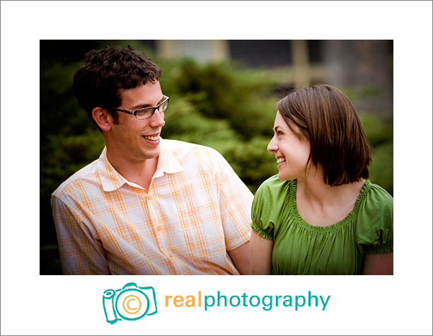
First of all, to the sticklers out there, I apologize for calling it vignetting. Actual vignetting is a lightening as the picture goes toward the edges, like this (not the world’s best example, but you get the idea).
But in today’s trends, that kind of vignetting isn’t what people mean when they talk about vignetting. In fact, they mean the opposite (which is actually called fall-off)…the photo gets darker as it goes toward the edges.
I love vignetting (the dark kind). I think it really frames a photo and makes the subject pop. I tend to be more heavy-handed in my vignetting than some photographers (especially with my black and whites) because I adore it so.
Vignetting can occur naturally or be an added effect.
When I use a wide angle lens on my 5d, I get some “fall-off” naturally…and some people call that a “con” of the 5d, but for me, it’s like AWESOME! Saves me some time in Photoshop!
But usually, I’m adding the vignette, not “correcting” it. Here are the four ways that I add vignetting.
The free way:
When I first started our business this was my method:
Use the “burn” tool in Photoshop. Make a duplicate layer of your background photo, burn the edges or general background area, and then lower the opacity of that lower until the vignette looks as good as you want it.
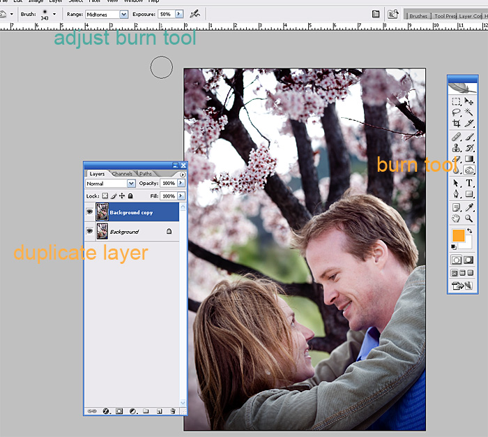
Pros: Free if you already have photoshop. Total control over where your vignette is (which is why I still occasionally go with this method).
Cons: You can’t burn in anything that is totally white, so if your sky is completely white, you’re out of luck.
The free-if-you-have-Lightroom way:
I use this 75% of the time now.
Go to the lens correction panel and adjust the sliders. Farther to the left the top slider, the darker it will be. Move the midpoint slider to bring the vignette farther into the center of the photo.
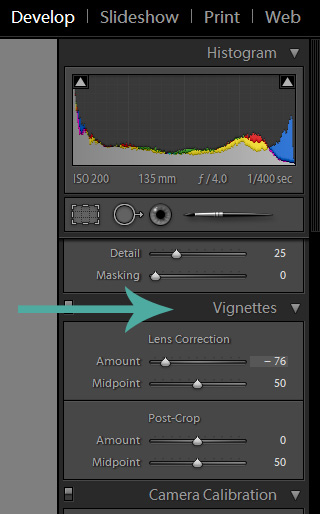
Pros: Easy peasey and almost free.
Cons: It applies the vignette to the pre-cropped photo. (Lightroom 2.0 does a post crop vignette, but call me crazy–it doesn’t look as good)
The $150 way:
(Before getting Lightroom, I used this 99% of the time…now I use it 24% of the time)
The Totally Rad Actions by Boutwell Studios has an “e-z burn” action that makes a very pretty vignette with the press of a button. Most photogs find this to be too strong and really drop the opacity. I usually use it at around 80%:
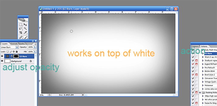
Pros: Easy. Awesome.
Cons: Expensive if you are only using it for the ez-burn action. If it’s used over a really light area, you can see it halo out toward the center and I’m not in love with that
The Other Expensive Option:
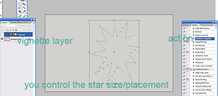
1% of the time, the Starburst Vignette in the Kevin Kubota Action Pack II is my vignette. It creates a star shaped vignette (looks way less god-awful than that sounds, so stay with me) and is best when you have a photo that needs a vignette, but you don’t want that haloing from the Totally Rad E-Z Burn and you can’t be bothered to burn it in yourself with the burn tool.
Pros: Subtle shape of vignette.
Cons: I hardly use it. The set is expensive if you’re just buying it for a vignette action that hardly gets used.
If anyone else has any requests for photography tips or photoshop tips, ask away!
Posted in Photoshop Tips


Comments
There's actually another free way as well, that isn't freehand--if that's what you're looking for with the Photoshop actions. In fact, you can even use this way to create your own (free) action. On CS2, it's a filter under Lens Correction--and just like Lightroom, you can choose dark/light & how much, and adjust the midpoint for a standardized vignette effect...
Rachel Dallaire May 09, 2008 at 10:55I do it yet another way, since I only have PSE right now. I create a new layer, fill it with black, select the rectangle marquee tool and form a rectangle a little bit away from the photo edge (how far depends on the look you want). Then go to Select>Feather and I usually choose 10 pixels (again depends on the look you want), the "marching ants"/selected area should have rounded corners now. Then you hit backspace on your keyboard which "knocks out" the selected area. Hit escape to remove the "marching ants". And then adjust opacity to taste. Easier and quicker than it sounds, although someday I would like to have other much easier options (ie CS3 and Lightroom). :-)