Scrapbook Saturday–my albums
Apr 12, 2008
(I think there are only three people left in the world that don’t know about this method of album-using yet, so this post is for them. For the rest, this might be a little boring.) :)
About two years ago, Tara Whitney shared with the Garden Girls her method of scrapbooking. It was fantastic and I fell instantly in love. The rest of the scrapbook world had moved past “chronological scrapbooking”–scrapbooking their photos in the order they were taken. Photos were now supposed to be scrapbooked as inspiration struck and put in albums or piles haphazardly.
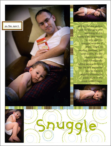
I just couldn’t do that because I’m obsessive. I wanted my photos to be seen in a linear fashion, so I kept an album for each year and filed my layouts accordingly. The problem came when I wanted to try 8.5×11 inch layouts, or when I didn’t know what to do with my digital layouts that I printed as 8×8 layouts (the photo paper to print a layout as a 12×12 is just too expensive to make it feasible). My solution then was to mount anything smaller than a 12×12 on black 12×12 cardstock.
When I saw the new solution, though–using 3 ring American Crafts albums to store a variety of page sizes in a variety of sizes of page protector–I was thrilled. The whole thing looked so interactive and awesome.
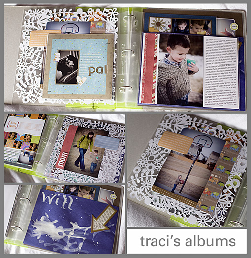
Here are a few shots of my 2008 album so far:

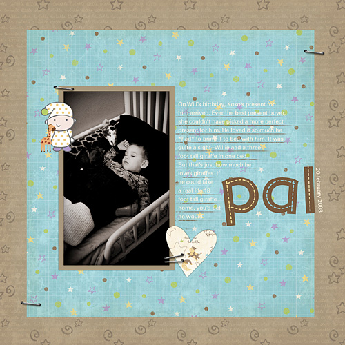
Digital layouts get printed as 8×8 (on 8.5×11 photo paper and then cropped), 8.5x11s get housed in their various page protectors (though you do have to punch an extra hole in the landscape oriented 8.5x11s to get them to go into the three ring albums), and 12x12s in theirs.
Because I’m sort of anal about keeping everything in order, I do keep an eye on my album and try to create layouts accordingly. So if I do a 12×12 of pictures in January, I’ll try to do another 12×12 of January pictures. Because otherwise you have an empty backside or a layout that is out of chronological order. But I don’t ALWAYS do that, I live with it if I haven’t (or plan to make a layout to fill that space). (In the case of the cool lace cardstock, I make a layout almost identical to the front on the back of the lace to preserve the see-through look (as shown above).
Ali Edwards recently started using this technique, and I loved her idea for making her own size of page protectors. Will painted his first picture at a neighbor’s house, and I wanted it to go straight into the album–no layout, but just that cute little picture. It was 12 inches wide and 9 inches tall. So I just snipped off the top of a 12×12 page protector to make it fit. (And stapled a little journaling block on there explaining that it was his first painting.)
I love that this method is more free and allows you to scrapbook in a more old-fashioned way–putting things in there of different sizes and shapes that aren’t even necessarily layouts. I think a lot more paintings and report cards will find their way into my albums in the coming years.
It’s a great way to deal with pictures that are too intimidating and important to scrapbook, too–just print them off as an 8×8 or 8.5×11, pop them into the page protector, and maybe add a small journaling block. That way you still get to look at it, even if you’re too scared that the layout you would make wouldn’t be perfect enough!
In many years, when the albums are less a work-in-progress and more a finished project, I plan on transfering them to post-bond albums (I’ll punch new holes in the page protectors if need be). The three ring is fine for now but I do love the way post-bond albums eliminate the center gap and look more formal. So when I’m an old lady in a nursing home, I’ll be sitting there with my hole punch, finishing off those albums.
Posted in Scrapbook


