We have (Photography) Tip Tuesdays, and now Photoshop Fridays…and I even have a plan for Saturdays, too (luckily you don’t have to wait long to find out what it is).

Photoshop has to be one of the most common image editing software programs around. Odds are it’s on your computer–even if you didn’t purchase it, you probably downloaded an illegal copy of Photoshop 7. (If you are receiving money for your photos, I beg of you to purchase a legal copy of Photoshop. It’s ridiculous to ask people to pay money for something you created with stolen goods.)

Even with all of those copies of Photoshop floating around the world, there are still many people that have no idea what it does or how to use it. So Photoshop Fridays are here to help. Sometimes it will be basic tips, sometimes things for a more advanced user. If you have specific Photoshop questions, just leave us a comment and I’ll either answer it, or find someone who can.

Lesson Number 1: Photoshop is not a magic wand.

The key to photoshop for the beginning user is subtlety. It is NOT the sort of thing that you should dive into thinking that you can make magic with. One of the most common beginner photoshop errors? Adding a person to the scene.

I give you exhibit a (and why I felt no guilt about showing my “Bad Picture” of Nic on Tuesday’s Photography Tips):
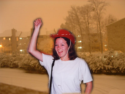
exhibit-a-bad-photoshop.jpg

(Just as a disclaimer, I was not drinking before this picture was taken. But I can’t decide whether that helps or hinders my case.)

This picture, as you can immediately tell, is two pictures. One, of a snowy background:
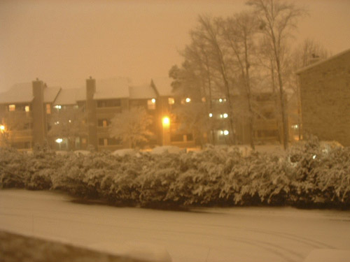
snow-background.jpg

And the other, of me trying on a hat at Disneyland:
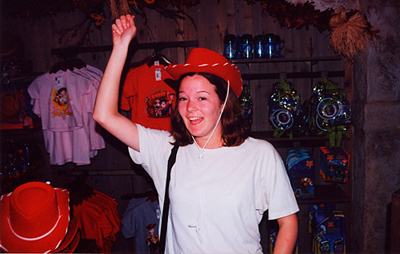
horrible-picture-of-traci.jpg

To amuse himself one night while we were dating many years ago, Nic decided to send me a picture to show me what it would be like if I was there in snowy Virginia with him. I remember that he could barely tell me to go check my email he was laughing so hard at his own picture joke.

To create a composite picture is easy enough. You open one photo (in this case, the snowy background). You open a new photo (in this case, a ridiculous picture of me at 18). You drag and drop your first photo onto your second photo. Go to your LAYERS menu, and under the opacity box (which right now will show 100%), lower it to around 50%–now you’d be able to see the picture of me under the snowy picture. Then grab your eraser tool and start erasing that top layer (in this case the snow scene) to reveal me beneath it:
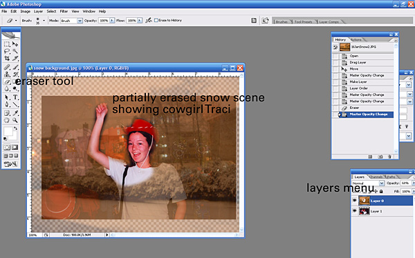
don’t try this at home

When you’re done erasing, you pop the opacity of that first layer back up to 100%, flatten the image and VOILA. You have something. And the word is SOMETHING.

The thing about most photo composites is that even if you’re very careful with your erasing, the picture still won’t look right unless you know what you’re doing. If you’re taking two pictures from two different scenes, dates, etc, the lighting and white balance will be different. In this case, we have a picture with direct flash, and an orangey no-flash, streetlamp lit picture.

To fix that, you either need to pull pictures from exactly the same day, angle, and lighting, or spend a lot of time trying to make the two pictures look like they were from the same moment. My advice is to leave it alone.

Here is a case where photo composites work (in this case, the infamous “head swap”):

(this is the part with actual advice, as opposed to a “please don’t do anything ugly like this” plea) For large groups, head swaps for photographers are probably inevitable. With dogs or little kids I *plan* on doing headswaps. I put myself in a single position and fire on burst mode. I get a ton of exactly the same shot with slightly different expressions on everyone’s face. That way if a person blinks or dog looks away, I can layer the photos, erase just that one area, and have it look seamless, because the two pictures were identical in angle and lighting.

Bottom line: Unless you set out to do it from the get-go, or really know what you’re doing and plan to adjust shadows and white balance and lighting effects and scale/angle, leave separate pictures as separate pictures. Otherwise they’ll look like a drunk cowgirl in a snowstorm.

Posted in Photoshop Tips


Lightroom is the latest thing in the photography software world.  And by latest, I mean, it’s a year old.  (It recently celebrated it’s one year anniversary, which basically means the world is waiting with baited breath for Lightroom 2.0.)

I am the last photographer on earth to adopt it.  I have downloaded the trial version no less than four times.  Each time I open it up, and the idea of importing all of my pictures into lightroom is enough to make me close it, forget about it, and then re-download the trial the next time I hear raves about it.

This time (trial number four) I’m determined to give it a decent try. Actually import some photos into it and see how things go.   I’ll report back on my findings.  But feel free to roll your eyes at the thought that Trial Number Four is going to be The Time I Actually Try It.

Posted in Photographer TipsPhotoshop Tips


In honor of our brand spanking new blog, we have a new feature: Tuesday Tips. (It sucks that “photography” doesn’t start with a “t,” too.)

Every Tuesday I’ll be talking about things you can do to make your photography better. Each week I’ll have a tip for the regular point-and-shooter, as well as a tip for those of you just starting out in the portrait business world. Feel free to leave a comment with questions you’d like me to answer!

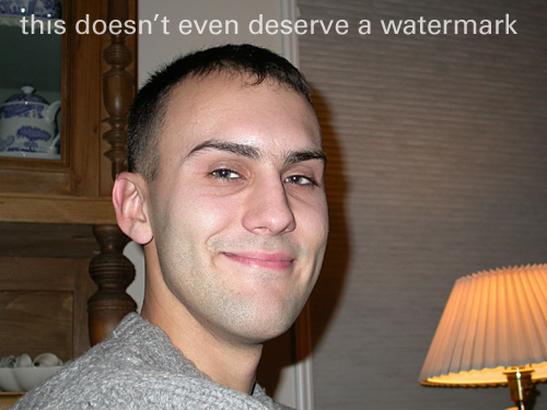
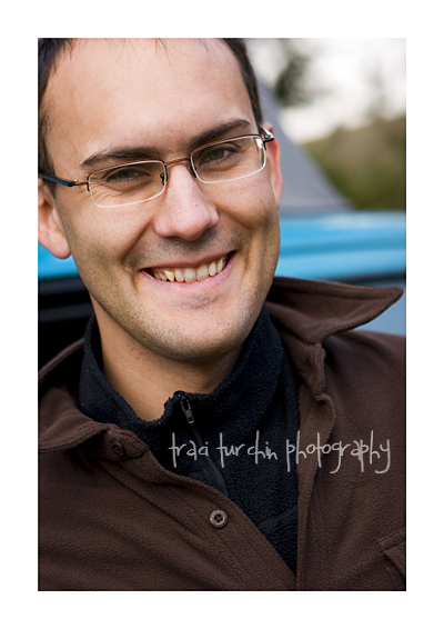
For our first month or two or Tuesdays, we’ll take apart two photos and find out why one is good, and the other makes me want to poke my own eyes out. They are both from the same type of “hey, honey–look over here” moment. No big fancy set-up, no “let’s go out and take pictures today” kind of vibe. Both were just me wanting to take a picture of Nic while he was doing something else (in one, talking to my family, in the other, talking to his dad). And just to prove that the Good Picture is nothing like a professional portrait, it was taken this fall while we were camping at Yellowstone and we hadn’t showered in a few days. See? Nothin’ professional about not showering.

Here is the Bad Picture, a good example of the type of pictures I took of Nic while we were in college:

bad-portrait.jpg

And The Good Picture, the type of snapshot portrait you’ll see from me these days:
nic-camping.jpg

The Basics (for you point-n-shooters)

One good, one bad. This week, I want to share a very easy tip that will improve your snapshots: get closer.

Long past are the days when the definition of a good headshot was having someone’s entire head be in the shot. What makes a face familiar? It probably isn’t the top of their head–it’s their eyes, nose and mouth. By getting closer, you make the portrait look more contemporary and also more eye-catching. In a box (or these days, folder on your computer) full of head-and-shoulders pictures (or worse–all full body), portraits that focus in on the key points will stand out.

In The Good Picture, we have what matters–Nic’s face. The top of his head is cut off, his left ear is only partly showing, but it’s a dynamic picture because we only see what we need to.

In The Bad Picture, Nic’s whole head is there, but so are a lot of other things. Is the lamp on the right important to the story of the photo? The china cabinet on the left? Definitely no. So instead of having a picture of our subject (in this case, Nic), we have a picture with the subject and a lot of clutter.

The next time you’re going to take a picture of your kid(s), husband, wife, or significant other, take a few steps closer. You’ll be glad you did!

Step it Up (for those who have been bitten by the photography bug)

In keeping with our “get closer” basic tip, here’s the opposite. For a more flattering portrait, step back, and zoom in with your lens (or put a longer prime on there).

You probably know instinctively that wide angle lenses aren’t so flattering. So it makes sense that the longer the lens, the more slimming the effect. The Bad Picture was taken on on just the wide side of normal. The Good Picture was taken 50mm on a 1.6 FOVCF body (meaning it was the equivalent of an 85mm lens and therefore telephoto).

The Bad Picture ends up distorting Nic’s face. It was taken from below his eye level (I’m shorter) with a slightly wide angle focal length, so it ends up widening his cheeks and broadening his nose. The Good Picture looks much more like the Nic I know and love, because you’re not getting that same distortion.

One of the best tips I learned this fall was to pull out my telephoto lenses for heavier clients (and anyone interested in being slimmed by a lens). At first the tip didn’t make sense to me, but then of course, it did. If the shorter your focal length is (and wider your angle) the less flattering an image is, surely the reverse is true.

If you really want to get into the physics of it, we can. [Stop reading here if physics make you want to stab pencils up your nose.] Telephoto lenses compress your perspective, bringing things closer together. So of course if you’re bringing the lines of a face [or waist] closer together, it will be slimming.

Next time you’re about to pick up your trusty 50mm, pause for a minute and ask yourself if it might be better to plop the 70-200 on there and take a few steps back, instead.

Posted in Photographer Tips