When I began quilting again this past summer, I spent a lot of time pouring over the gorgeous quilts at Film in the Fridge. I absolutely adored the combination of Hope Valley and charcoal in this quilt, and loving the string quilts, I decided that I would make a Hope Valley string quilt with charcoal center strips. (Later on flickr I saw other quilters had made the same decision!)
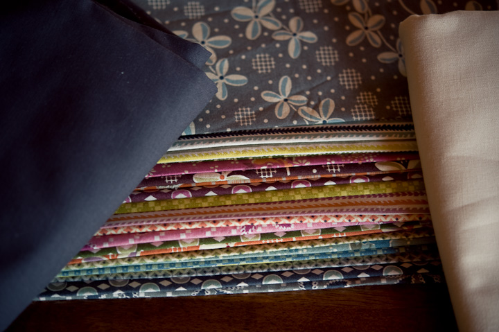
This week, though, as I prepared to start cutting into my now washed and pressed Hope Valley stack, I saw a Hope Valley quilt that used cream to set off the prints. And now I’m torn between cream and charcoal.










A.J.Dub - I like the cream with it.
Dolores - Having had a look at the quilts you’re talking about and some cream versions, I have to say that I think the charcoal unifies the colours better and gives it a more modern edge.
Kelly - I’m starting to think that cream is the new neutral… 🙂 Can’t wait to see what you decide. 🙂
Steph - What I do is lay out a yard of each of the solids and put the FQs on each of them and take a photo. Looking at the photo usually shows a clear winner.
A.J. Dub - I like the cream with this. To me it shows off the colors rather than blends them. But then it depends, what look are you going for?