In honor of our brand spanking new blog, we have a new feature: Tuesday Tips. (It sucks that “photography” doesn’t start with a “t,” too.)
Every Tuesday I’ll be talking about things you can do to make your photography better. Each week I’ll have a tip for the regular point-and-shooter, as well as a tip for those of you just starting out in the portrait business world. Feel free to leave a comment with questions you’d like me to answer!
For our first month or two or Tuesdays, we’ll take apart two photos and find out why one is good, and the other makes me want to poke my own eyes out. They are both from the same type of “hey, honey–look over here” moment. No big fancy set-up, no “let’s go out and take pictures today” kind of vibe. Both were just me wanting to take a picture of Nic while he was doing something else (in one, talking to my family, in the other, talking to his dad). And just to prove that the Good Picture is nothing like a professional portrait, it was taken this fall while we were camping at Yellowstone and we hadn’t showered in a few days. See? Nothin’ professional about not showering.
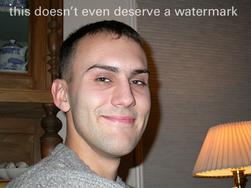
Here is the Bad Picture, a good example of the type of pictures I took of Nic while we were in college:

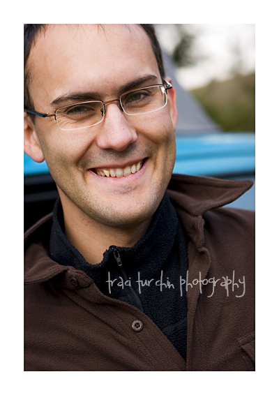
And The Good Picture, the type of snapshot portrait you’ll see from me these days:

The Basics (for you point-n-shooters)
One good, one bad. This week, I want to share a very easy tip that will improve your snapshots: get closer.
Long past are the days when the definition of a good headshot was having someone’s entire head be in the shot. What makes a face familiar? It probably isn’t the top of their head–it’s their eyes, nose and mouth. By getting closer, you make the portrait look more contemporary and also more eye-catching. In a box (or these days, folder on your computer) full of head-and-shoulders pictures (or worse–all full body), portraits that focus in on the key points will stand out.
In The Good Picture, we have what matters–Nic’s face. The top of his head is cut off, his left ear is only partly showing, but it’s a dynamic picture because we only see what we need to.
In The Bad Picture, Nic’s whole head is there, but so are a lot of other things. Is the lamp on the right important to the story of the photo? The china cabinet on the left? Definitely no. So instead of having a picture of our subject (in this case, Nic), we have a picture with the subject and a lot of clutter.
The next time you’re going to take a picture of your kid(s), husband, wife, or significant other, take a few steps closer. You’ll be glad you did!
Step it Up (for those who have been bitten by the photography bug)
In keeping with our “get closer” basic tip, here’s the opposite. For a more flattering portrait, step back, and zoom in with your lens (or put a longer prime on there).
You probably know instinctively that wide angle lenses aren’t so flattering. So it makes sense that the longer the lens, the more slimming the effect. The Bad Picture was taken on on just the wide side of normal. The Good Picture was taken 50mm on a 1.6 FOVCF body (meaning it was the equivalent of an 85mm lens and therefore telephoto).
The Bad Picture ends up distorting Nic’s face. It was taken from below his eye level (I’m shorter) with a slightly wide angle focal length, so it ends up widening his cheeks and broadening his nose. The Good Picture looks much more like the Nic I know and love, because you’re not getting that same distortion.
One of the best tips I learned this fall was to pull out my telephoto lenses for heavier clients (and anyone interested in being slimmed by a lens). At first the tip didn’t make sense to me, but then of course, it did. If the shorter your focal length is (and wider your angle) the less flattering an image is, surely the reverse is true.
If you really want to get into the physics of it, we can. [Stop reading here if physics make you want to stab pencils up your nose.] Telephoto lenses compress your perspective, bringing things closer together. So of course if you’re bringing the lines of a face [or waist] closer together, it will be slimming.
Next time you’re about to pick up your trusty 50mm, pause for a minute and ask yourself if it might be better to plop the 70-200 on there and take a few steps back, instead.


